Content
CSS only masonry layout
Building a "masonry" style image gallery with CSS only
What is a masonry layout
A masonry layout is simply a gallery of images in which elements are scaled to obtained a single block with straight borders on the left and the right (in the case of an horizontal layout).
While doing a basic layout is relatively easy, it gets harder when the direct children of the gallery aren't the images themselves, for instance when they are links to the page containing its full size.
Example:

Code
html for the previous example:
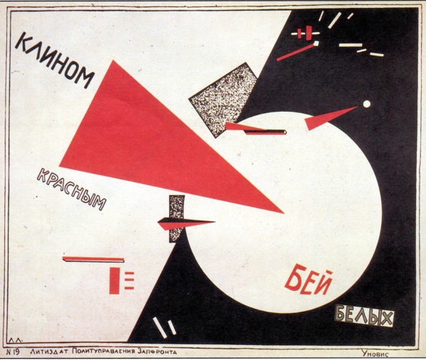
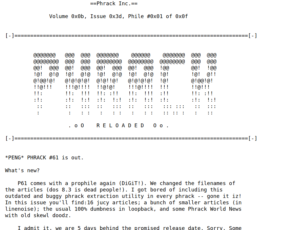
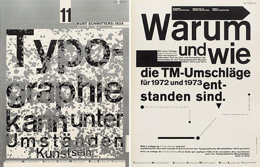
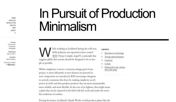
 1 <div class = "flex-masonry">
 2   <a href ="/images/el-lissitzky_beat-the-whites-with-the-red-wedge.png">
 3    <img src = "/images/el-lissitzky_beat-the-whites-with-the-red-wedge.png" alt = "el lissitzky beat the whites with the red-wedge">
 4   </a>
 5
 6   <a href ="http://www.phrack.org/issues/61/1.html">
 7     <img src = "/images/phrack61_intro.png" alt = "phrack61 zine intro">
 8   </a>
 9
10    <a href ="/images/weingart.png">
11     <img src = "/images/weingart.png" alt = "weingart">
12   </a>
13
14    <a href = "https://brandur.org/minimalism">
15     <img src = "/images/brandur.org.png">
16   </a>
17
18    <a href = "http://cachestocaches.com/2018/9/ai-translation-more-language/">
19     <img src = "/images/cachestocaches.com.png">
20   </a>
21 </div>
CSS:
 1  .flex-masonry {
 2    display: flex;
 3    flex-wrap: wrap;
 4    margin: auto;
 5  }
 6
 7  .flex-masonry a {
 8    overflow: hidden;
 9  }
10
11  .flex-masonry a img {
12    max-height: 20vh;
13    object-fit: cover;
14    transform: scale(1);
15    transition: all 0.3s ease;
16    width: auto;
17  }
18
19  .flex-masonry a img:hover {
20    transform: scale(1.05);
21   }
22
23  /*https://medium.com/@iamryanyu/how-to-align-last-flex-item-to-right-73512e4e5912*/
24  .flex-masonry:last-child {
25    margin-left: auto;
26  }
27
28  .flex-masonry > a {
29    align-items: stretch;
30    display: flex;
31    flex-direction: column;
32    flex: auto;
33    margin: 1px;
34  }
35
36
37  @media only screen and (max-width: 800px) {
38    /* For mobile phones: */
39    /* switch to one image per line, and no zoom effect */
40    .flex-masonry a {
41      max-width: none;
42      display: initial;
43    }
44
45    .flex-masonry a img {
46      max-height: initial;
47      min-height: initial;
48      height: auto;
49      width: 100%;
50    }
51
52    .flex-masonry a:hover img {
53      transform: none;
54    }
55  }